WPF の 標準コントロールを マテリアルデザインスタイル に変えてくれるパッケージを使って、簡単にお洒落な WPF アプリを作っていきます。
マテリアルデザインとは、Google が推奨する 一貫性のある馴染みやすいデザインのことです。Google が推奨しているということは、世界中で愛されるということになるので、世界基準の一流デザインを取り入れることになります。
マテリアルデザインを取り入れたアプリが簡単に作れる「MaterialDesignThemes」パッケージを使って、いろいろ試していきたいと思います。
https://github.com/MaterialDesignInXAML/MaterialDesignInXamlToolkit
今回は、MaterialDesignThemes の Drawer を試したいと思います。
事前準備
プロジェクトを作成して、NuGet で「MaterialDesignThemes」パッケージを入れます。
詳しくは、前の記事を参考にして下さい。
https://noitaro.github.io/wpf-materialdesign-dialog/
処理
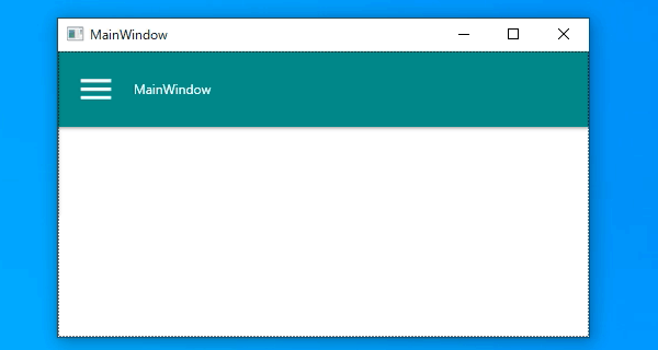
MainWindow.xaml
1
2
3
4
5
6
7
8
9
10
11
12
13
14
15
16
17
18
19
20
21
22
23
24
25
26
27
28
29
30
31
32
33
34
35
36
37
38
39
40
41
42
43
44
45
46
| <Window
x:Class="WpfApp3.MainWindow"
xmlns="http://schemas.microsoft.com/winfx/2006/xaml/presentation"
xmlns:x="http://schemas.microsoft.com/winfx/2006/xaml"
xmlns:d="http://schemas.microsoft.com/expression/blend/2008"
xmlns:materialDesign="http://materialdesigninxaml.net/winfx/xaml/themes"
xmlns:mc="http://schemas.openxmlformats.org/markup-compatibility/2006"
Title="MainWindow" Width="500" Height="300" mc:Ignorable="d">
<Window.Resources>
<ResourceDictionary>
<ResourceDictionary.MergedDictionaries>
<ResourceDictionary Source="pack://application:,,,/MaterialDesignThemes.Wpf;component/Themes/MaterialDesignTheme.Light.xaml" />
<ResourceDictionary Source="pack://application:,,,/MaterialDesignColors;component/Themes/Recommended/Primary/MaterialDesignColor.Teal.xaml" />
<ResourceDictionary Source="pack://application:,,,/MaterialDesignThemes.Wpf;component/Themes/MaterialDesignTheme.TextBlock.xaml" />
<ResourceDictionary Source="pack://application:,,,/MaterialDesignThemes.Wpf;component/Themes/MaterialDesignTheme.Button.xaml" />
<ResourceDictionary Source="pack://application:,,,/MaterialDesignThemes.Wpf;component/Themes/MaterialDesignTheme.ToggleButton.xaml" />
</ResourceDictionary.MergedDictionaries>
</ResourceDictionary>
</Window.Resources>
<materialDesign:DrawerHost IsLeftDrawerOpen="{Binding ElementName=MenuToggleButton, Path=IsChecked}">
<materialDesign:DrawerHost.LeftDrawerContent>
<Grid Width="200">
<materialDesign:ColorZone Mode="PrimaryMid" materialDesign:ShadowAssist.ShadowDepth="Depth1" Padding="16" Height="150">
<Grid>
<Button Style="{StaticResource MaterialDesignFloatingActionLightButton}" HorizontalAlignment="Left" VerticalAlignment="Top">
<materialDesign:PackIcon Kind="AccountCircleOutline" Height="Auto" Width="Auto" />
</Button>
<TextBlock FontWeight="Bold" Text="LeftDrawerContent" VerticalAlignment="Bottom" Margin="0,0,0,20.96"/>
<TextBlock TextWrapping="Wrap" VerticalAlignment="Bottom" Text="Otukare sama." Margin="0,0,21,0"/>
<materialDesign:PackIcon Kind="ChevronDown" HorizontalAlignment="Right" Width="Auto" Height="16" VerticalAlignment="Bottom" />
</Grid>
</materialDesign:ColorZone>
</Grid>
</materialDesign:DrawerHost.LeftDrawerContent>
<Grid>
<materialDesign:ColorZone Padding="16" materialDesign:ShadowAssist.ShadowDepth="Depth1" Mode="PrimaryMid">
<DockPanel>
<StackPanel Orientation="Horizontal">
<ToggleButton x:Name="MenuToggleButton" IsChecked="False" Style="{DynamicResource MaterialDesignHamburgerToggleButton}" />
<TextBlock Margin="16,0,0,0" VerticalAlignment="Center" Text="MainWindow" />
</StackPanel>
</DockPanel>
</materialDesign:ColorZone>
</Grid>
</materialDesign:DrawerHost>
</Window>
|
ちょっと長いですが、やっていることは単純です。
ResourceDictionary.MergedDictionaries で必要なリソースを読み込んで、materialDesign:DrawerHost で全体を括っています。
materialDesign:DrawerHost.LeftDrawerContent の中に ナビゲーションドロワー に出したい内容を書いて、ToggleButton の IsChecked で ナビゲーションドロワー の開閉を制御しています。
おわりに
ナビゲーションドロワー があるだけで、画面内がスッキリして 最近の Android と同じ操作性になったと思います。
マテリアルデザインを使うだけで、操作性に一貫性が出て ユーザーフレンドリー なアプリが簡単に作れるので、是非挑戦してみて下さい。
GitHub
ソースコード