私の大好きな MaterialDesignThemes に PopupBox コントロール があります。
使ってみて躓いたので、簡単に使い方をまとめます。
準備
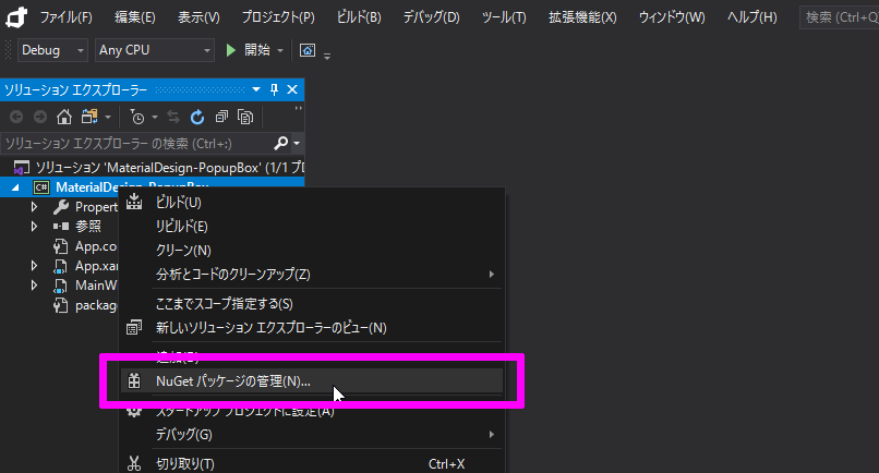
NuGet で MaterialDesignThemes を インストールする
WPF プロジェクト を右クリックして「NuGet パッケージの管理」を選択します。
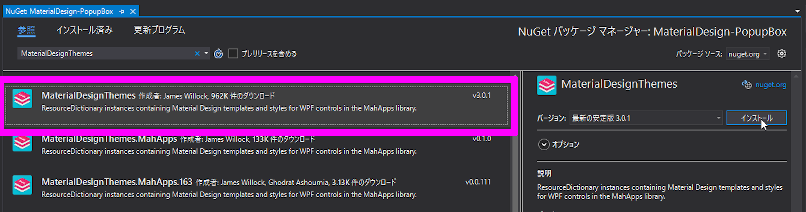
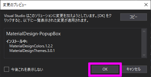
検索欄に「MaterialDesignThemes」を入力して MaterialDesignThemes を インストールします。
MainWindow に Resources を読み込ませる
1
2
3
4
5
6
7
8
9
10
11
12
13
14
15
16
17
18
19
20
21
22
| <Window x:Class="MaterialDesign_PopupBox.MainWindow"
xmlns="http://schemas.microsoft.com/winfx/2006/xaml/presentation"
xmlns:x="http://schemas.microsoft.com/winfx/2006/xaml"
xmlns:d="http://schemas.microsoft.com/expression/blend/2008"
xmlns:mc="http://schemas.openxmlformats.org/markup-compatibility/2006"
xmlns:local="clr-namespace:MaterialDesign_PopupBox"
xmlns:materialDesign="http://materialdesigninxaml.net/winfx/xaml/themes"
mc:Ignorable="d"
Background="{DynamicResource MaterialDesignPaper}"
TextElement.Foreground="{DynamicResource MaterialDesignBody}"
Title="MainWindow" Height="450" Width="800">
<Window.Resources>
<ResourceDictionary>
<ResourceDictionary.MergedDictionaries>
<materialDesign:BundledTheme BaseTheme="Light" PrimaryColor="LightGreen" SecondaryColor="Lime" />
<ResourceDictionary Source="pack://application:,,,/MaterialDesignThemes.Wpf;component/Themes/MaterialDesignTheme.PopupBox.xaml" />
</ResourceDictionary.MergedDictionaries>
</ResourceDictionary>
</Window.Resources>
<Grid>
</Grid>
</Window>
|
これで準備が整いました。
では、いろいろ試して行きましょう。
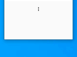
基本系
まずは、基本系 から行きます。
テーマを当てていない PopupBox です。
1
2
3
4
5
6
7
| <materialDesign:PopupBox>
<StackPanel>
<Button Content="1"/>
<Button Content="2"/>
<Button Content="3"/>
</StackPanel>
</materialDesign:PopupBox>
|
三点ボタンをクリックすると PopupBox が開きます。 まあ至って普通の PopupBox ですね。
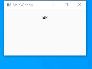
三点ボタン を別のに変える
三点ボタン を別のに変えます。
1
2
3
4
5
6
7
| <materialDesign:PopupBox ToggleContent="開く">
<StackPanel>
<Button Content="1"/>
<Button Content="2"/>
<Button Content="3"/>
</StackPanel>
</materialDesign:PopupBox>
|
開く方向を変える
「PlacementMode」を設定する事で PopupBox の開く方向を変えることが出来ます。
1
2
3
4
5
6
7
| <materialDesign:PopupBox PlacementMode="RightAndAlignBottomEdges">
<StackPanel>
<Button Content="1"/>
<Button Content="2"/>
<Button Content="3"/>
</StackPanel>
</materialDesign:PopupBox>
|
PlacementMode に「RightAndAlignBottomEdges」設定すると、下揃えで右側に表示されるようになります。
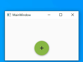
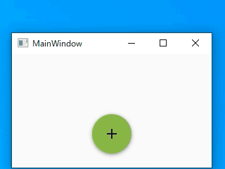
スタイル適応系
PopupBox に「MaterialDesignMultiFloatingActionPopupBox」スタイルを当ててみます。
1
2
3
4
5
6
7
| <materialDesign:PopupBox Style="{StaticResource MaterialDesignMultiFloatingActionPopupBox}">
<StackPanel>
<Button Content="1"/>
<Button Content="2"/>
<Button Content="3"/>
</StackPanel>
</materialDesign:PopupBox>
|
三点ボタン が MaterialDesign の 丸ボタンに変わり、マウスオーバーで PopupBox が表示されるようになりました。
色は Resources で読み込んだ PrimaryColor が使われています。
マウスオーバーで開かなくしたい時は「PopupMode=”Click”」を設定します。
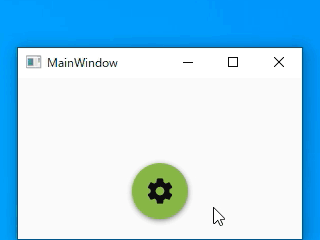
丸ボタン を 歯車アイコン に変える
丸ボタンを変える事ができます。
1
2
3
4
5
6
7
8
9
10
| <materialDesign:PopupBox Style="{StaticResource MaterialDesignMultiFloatingActionPopupBox}">
<materialDesign:PopupBox.ToggleContent>
<materialDesign:PackIcon Kind="Cog" Width="30" Height="30"/>
</materialDesign:PopupBox.ToggleContent>
<StackPanel>
<Button Content="1"/>
<Button Content="2"/>
<Button Content="3"/>
</StackPanel>
</materialDesign:PopupBox>
|
歯車アイコンに変えてみました。
マウスオーバーで 45度 傾きます。かわいい
PopupBox 内のアイテム は好きに変えれます。
1
2
3
4
5
6
7
8
9
10
11
| <materialDesign:PopupBox Style="{StaticResource MaterialDesignMultiFloatingActionPopupBox}"
StaysOpen="True" PopupMode="Click" >
<materialDesign:PopupBox.Resources>
<ResourceDictionary Source="pack://application:,,,/MaterialDesignThemes.Wpf;component/Themes/MaterialDesignTheme.CheckBox.xaml" />
</materialDesign:PopupBox.Resources>
<StackPanel>
<CheckBox Style="{StaticResource MaterialDesignCheckBox}" HorizontalAlignment="Center" Margin="5"/>
<CheckBox Style="{StaticResource MaterialDesignCheckBox}" HorizontalAlignment="Center" Margin="5"/>
<CheckBox Style="{StaticResource MaterialDesignCheckBox}" HorizontalAlignment="Center" Margin="5"/>
</StackPanel>
</materialDesign:PopupBox>
|
PopupBox を開いたままにするには「StaysOpen=”True”」を設定します。
おわりに
WPF は取っ付きにくいイメージがあると思いますが、慣れてしまうと簡単にオシャレなツールが作れるようになります。
楽しいのでオススメです。